Back
Berkeley Art Museum & Pacific Film Archive
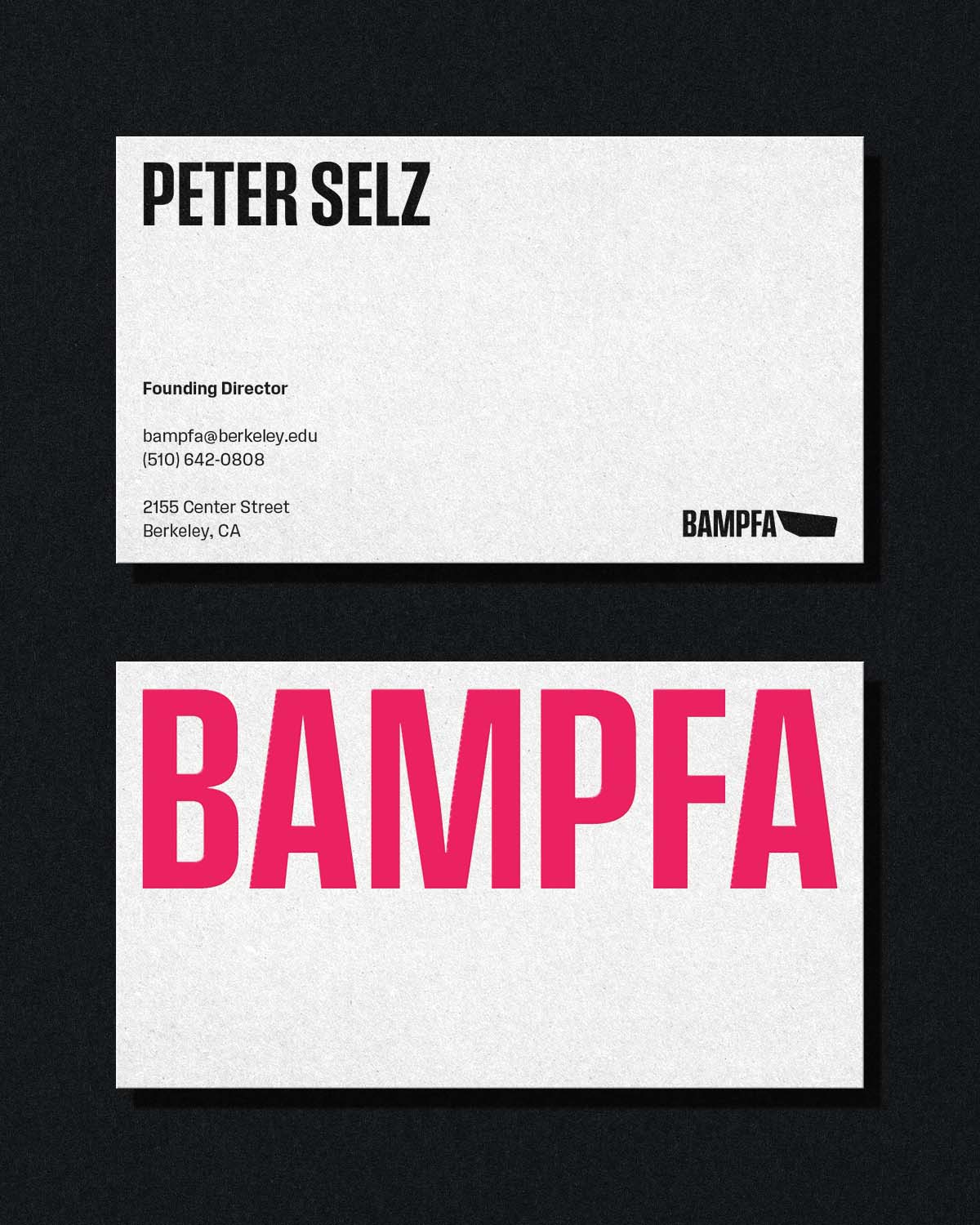
A spec brand overhaul with two major problems to solve. BAMPFA's visual language was beginning to fragment, they needed a system to align them across all touchpoints from billboards to stickers, from print to screen. In conjunction, the brand needed a bolder graphic presence to stand out from the Berkeley landscape and match the striking presence of their own building. This rebrand aims to unify the system and turn up the volume.

A Bolder BAMPFA
Heavy weight titles, set in Signal Type Foundry's Field Gothic, stretch edge to edge, drawing the eye towards BAMPFA's flyers, posters, and all other contexts designed to capture attention.
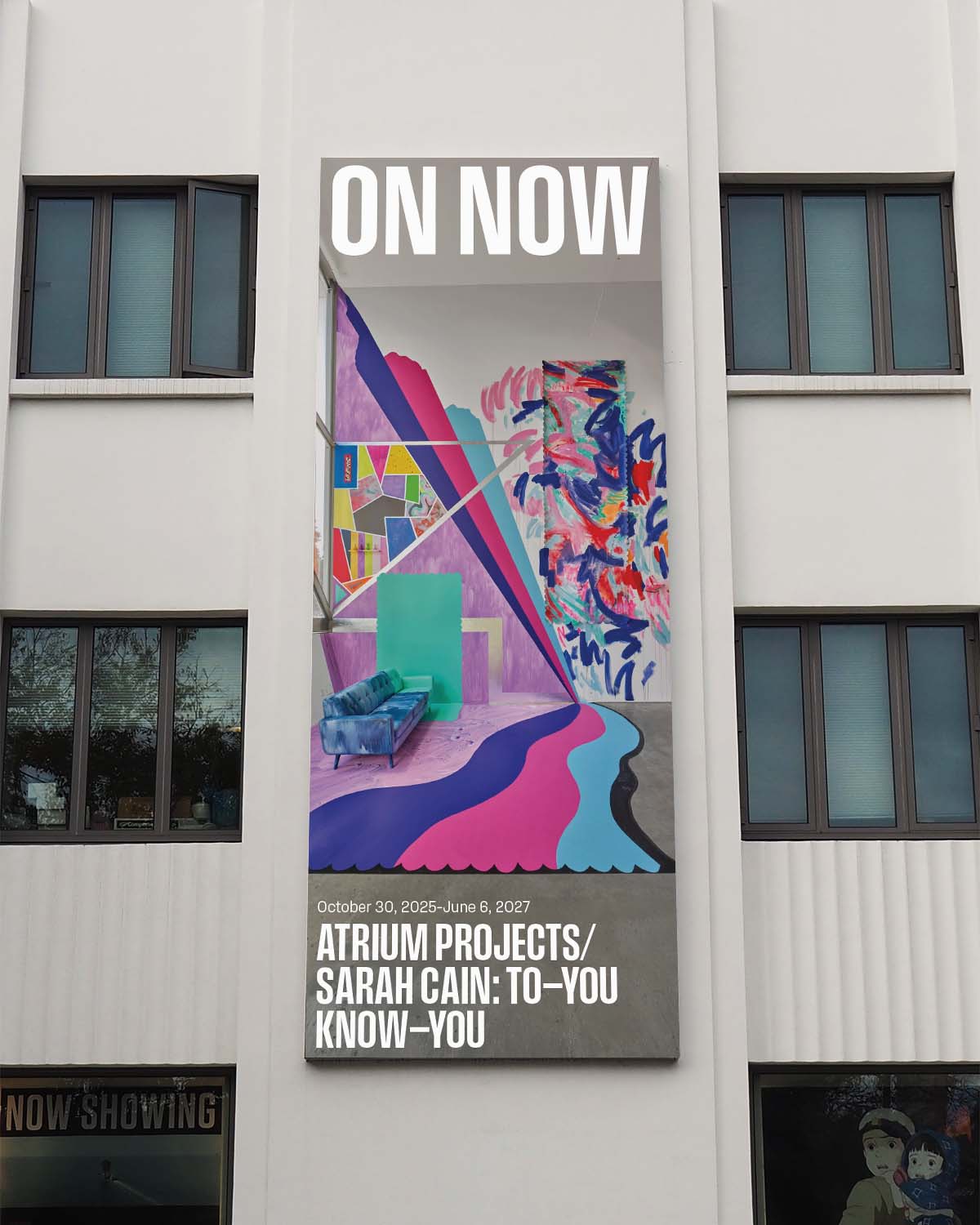
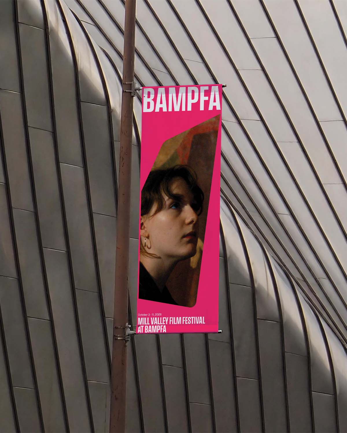
Not Just a Pretty Face
BAMPFA's stunning facade is a major attractor, however the building is such an eye-catcher that the graphics communicating what's happening inside have to be equally strong and compelling in order to be noticed. High contrast in element weight and color are utilized to properly garner attention and match the building's bold energy.