Back
Berkeley Art Museum & Pacific Film Archive
A spec brand overhaul with two major problems to solve. BAMPFA's visual language was beginning to fragment, they needed a system to align them across all touchpoints from billboards to stickers, from print to screen. In conjunction, the brand needed a bolder graphic presence to stand out from the Berkeley landscape and match the striking presence of their own building. This rebrand aims to unify the system and turn up the volume. Read the full write-up here.

A Bolder BAMPFA
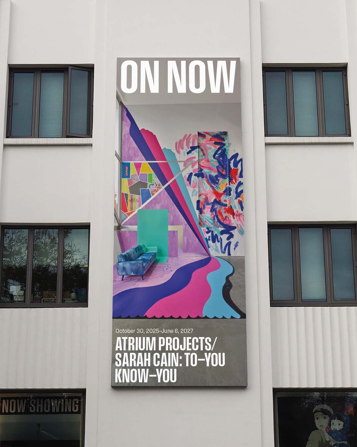
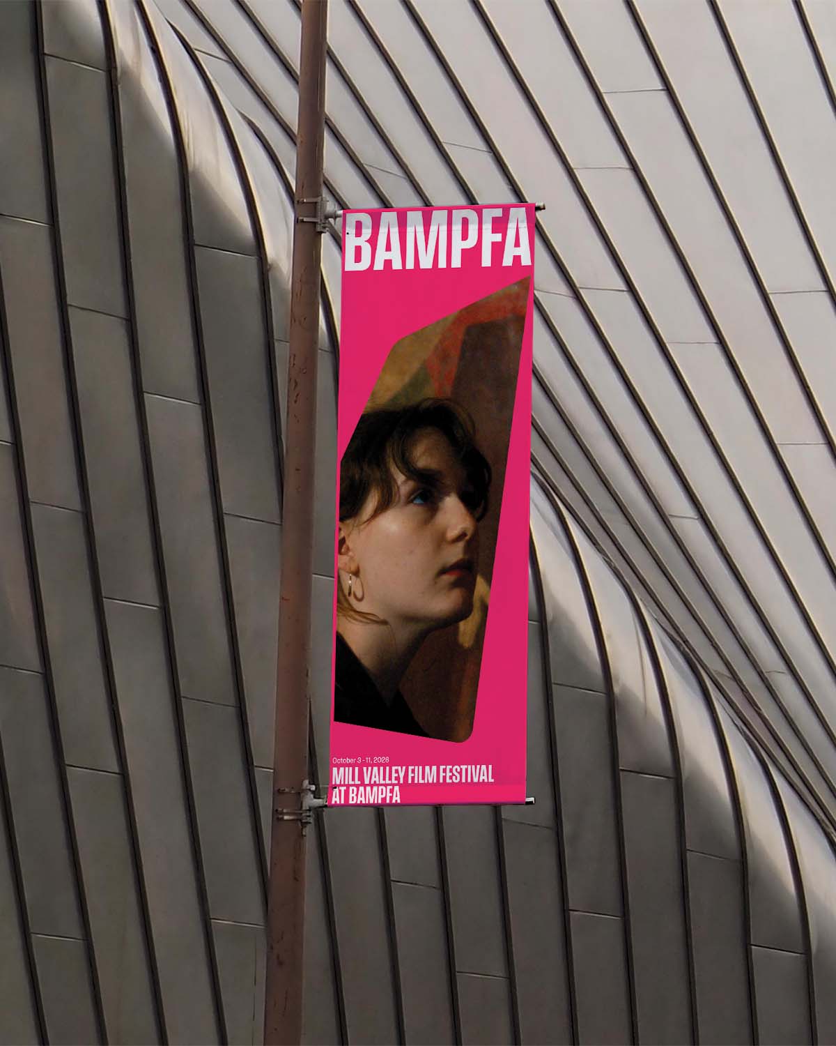
Heavy weight titles, set in Signal Type Foundry's Field Gothic, stretch edge to edge, drawing the eye towards BAMPFA's flyers, posters, and all other contexts designed to capture attention.
Not Just a Pretty Face
BAMPFA's stunning facade is a major attractor, however the building is such an eye-catcher that the graphics communicating what's happening inside have to be equally strong and compelling in order to be noticed. High contrast in element weight and color are utilized to properly garner attention and match the building's bold energy.
Context
BAMPFA is a UC Berkeley-affiliated arts institution dedicated to creating a "more inclusive and artistic world." It has an extensive catalog including tens-of-thousands of artworks and films which are displayed through their diverse slate of art exhibitions, film screenings, artistic talks, live performances, and educational programs. With such an extensive footprint, BAMPFA has many graphic needs, inside its museum and out, including, but not limited to, banners, posters, digital billboards, social media posts, brochures, a website, and more.
With no unifying visual system, BAMPFA's various graphic touchpoints were beginning to fall out of alignment, decreasing the strength of the institution's identity and the effectiveness of its messaging. What did exist of a brand was fragmented, and specifically fell short on the front of advertising. The bold Diller Scofidio + Renfro-designed exterior was overpowering the graphic signaling of the great programming that was actually happening inside.
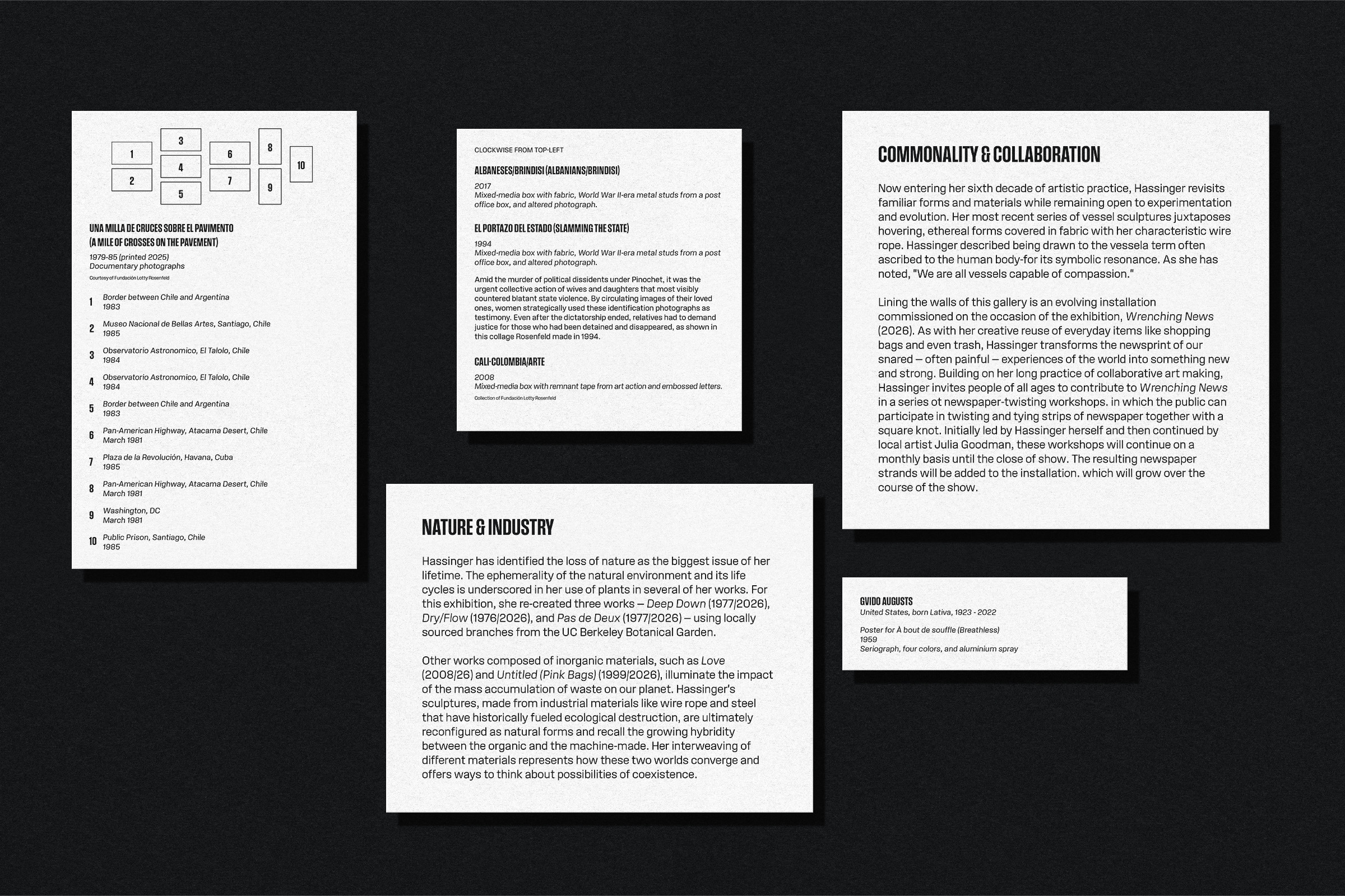
Two primary objectives appeared through the research process. First, the brand needed alignment. A unifying system that could flex to fit all sizes, mediums, and circumstances that may be required by the institution. Second, the visual language needed a greater range. Outside, it has to be loud enough to compete with the bold facade and the busy streets around it, while still being capable of quieting down inside the galleries and letting the art lead.
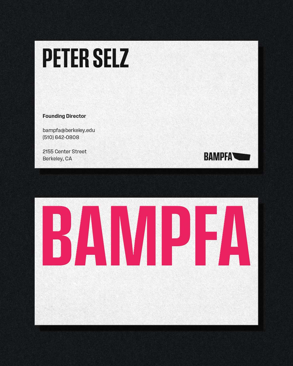
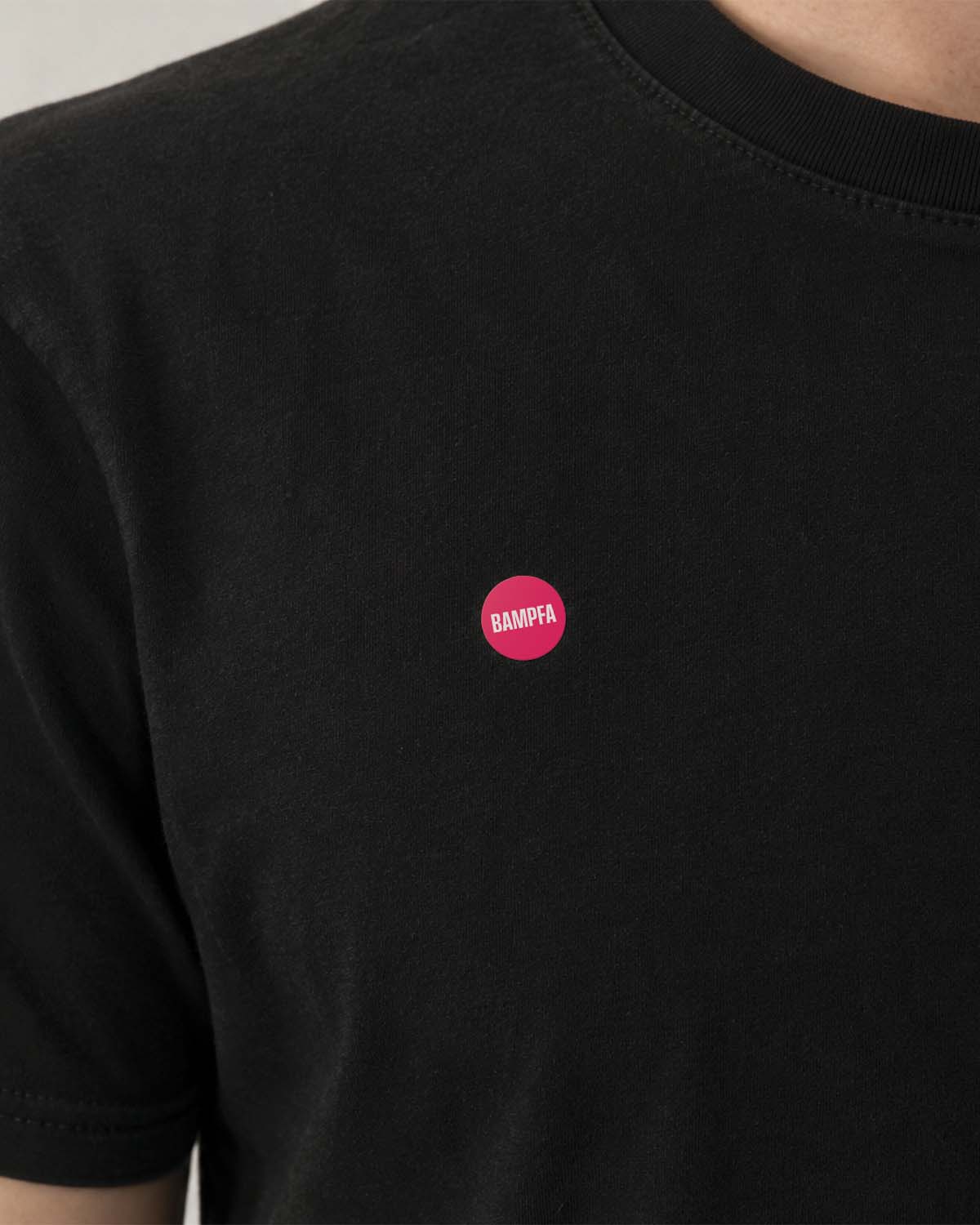
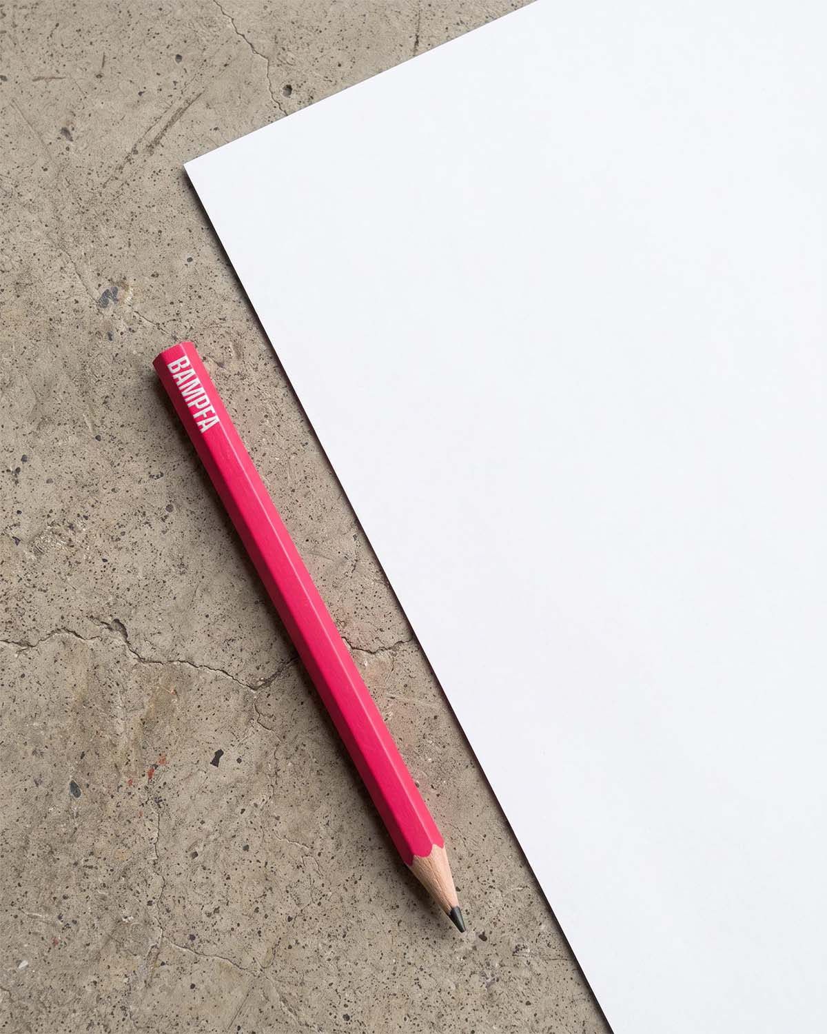
A 3-color palette serves the dynamic range, allowing simple black and white compositions to accommodate images and surrounding content while the bold pink provides a jolting pop of color when needed. Signal Type Foundry's Field Gothic was chosen as the one and only font family with it's 60+ typeface variants covering every possible scenario. When words demand attention, bold headers stretch edge-to-edge. When layouts need space, headers can shrink towards the corners and give content room to shine.